3rd Grade Students Explore Snake Designs
This is Margaret Koreman's sixth year as the visual arts teacher at Decatur Elementary. Mrs. Koreman has a Master's Degree in Art Education from the School of the Art Institute of Chicago, where she served on the teaching faculty. Mrs. Koreman regularly supports regional art education programs by hosting and mentoring student teachers. She regularly presents professional workshops on teaching practices at conferences for the Illinois Art Education Association (IAEA), the National Art Education Association (NAEA), and various local and regional organizations.
Mrs. Koreman helped establish the art education program at Intuit: The Center for Intuitive and Outsider Art and recently completed Intuit's 2022 teacher fellowship. Mrs. Koreman currently serves on the board of Chicago Arts Partnership in Education (CAPE).
Mrs. Koreman’s teaching practice focuses on contemporary art and a multi-media approach. Her enthusiasm for the Chicago art community has led to numerous partnerships that expose students to local arts organizations and resources through field trips and workshops that examine how art impacts our neighborhoods.

Connection

For my choice board, I picked the ‘using objects to represent you’ box. When looking at the slides, I got inspired when somebody used peanut butter and jelly to make the Mona Lisa; despite not using a pencil or brush, they still managed to recreate it. So I decided to make the ‘Girl with a Pearl Earring’ because the painting is quite famous and it would be easy to identify.
To make it, I used objects around my house. I also made sure the objects still represented me, though, so they would follow the prompt. I used a lot of pencils. They represent my challenges since they are pointy and creative because they are used to draw. I used some toys (legos, figures) to represent my youth and joy. I used the folded napkin to represent changes because a napkin is always being folded. In the end, I was pretty happy with the artwork because I could tell it was her, and so could others.
Amelia 5th Grade


Notan: Positive and Negative Space
The theme expressed in the 2 notans was a tight, but relaxed theme. I tried to make the shapes very relaxed and flowy, making the shapes more abstract. I made the shapes compact and tight to contrast the relaxed shapes. This interested me because I liked how the shapes were close because it made the art look like one whole, but split apart, like a puzzle.
I chose my materials by using the necessary materials, but the most significant part of me was the colors of the paper. The colors would help how to tell which part of the art is negative, and which part is positive. I chose white and purple for the more complicated one, because the contrast is very strong, as purple is dark and close to black, while white is a bright and noticeable color. The many repeated lines from the purple and white art help point out the white and purple. I chose blue and yellow because I liked how they weren’t complicated contrasted but they still look good together. Blue is a cool tone, while yellow is a warm tone. I like how they still point out each other, but not as much as the purple and white. I didn’t want it to point out too much because the shapes were very simple and large so they already helped contrast each other with that a little bit.
I encountered multiple difficulties while making my notans. First, I didn’t know how I was going to approach my complicated (purple and white) notan, since it takes up the whole space of the paper so I wouldn’t know what goes where. I figured it out by realizing that I could just trace the outline of the paper rectangle and erase it later. Second, I would constantly glue the wrong side of the paper making the art look messy. I did this so much on one piece, I just threw it out. I restarted and I'm proud of my work. Lastly, I didn’t know which way to flip the paper cut-outs for some parts. I didn’t know if I should flip it vertically, horizontally, or diagonally. In the end, I just flipped it to whatever I felt like I liked!
I think I could take this to another level by making half of the art contrasted from the other half. I don’t know if I should do it with an art similar to the purple and white one, as the constant flipping would make it more difficult, but the more I try, I think I could get better at it. I’ve actually tried this before and it was so hard so I just decided to do it next time when I have more experience. I could also use less abstract shapes and try to show a story with my art. I could try to represent objects through my art to tell a story that could teach the viewer something notable.
Angelica
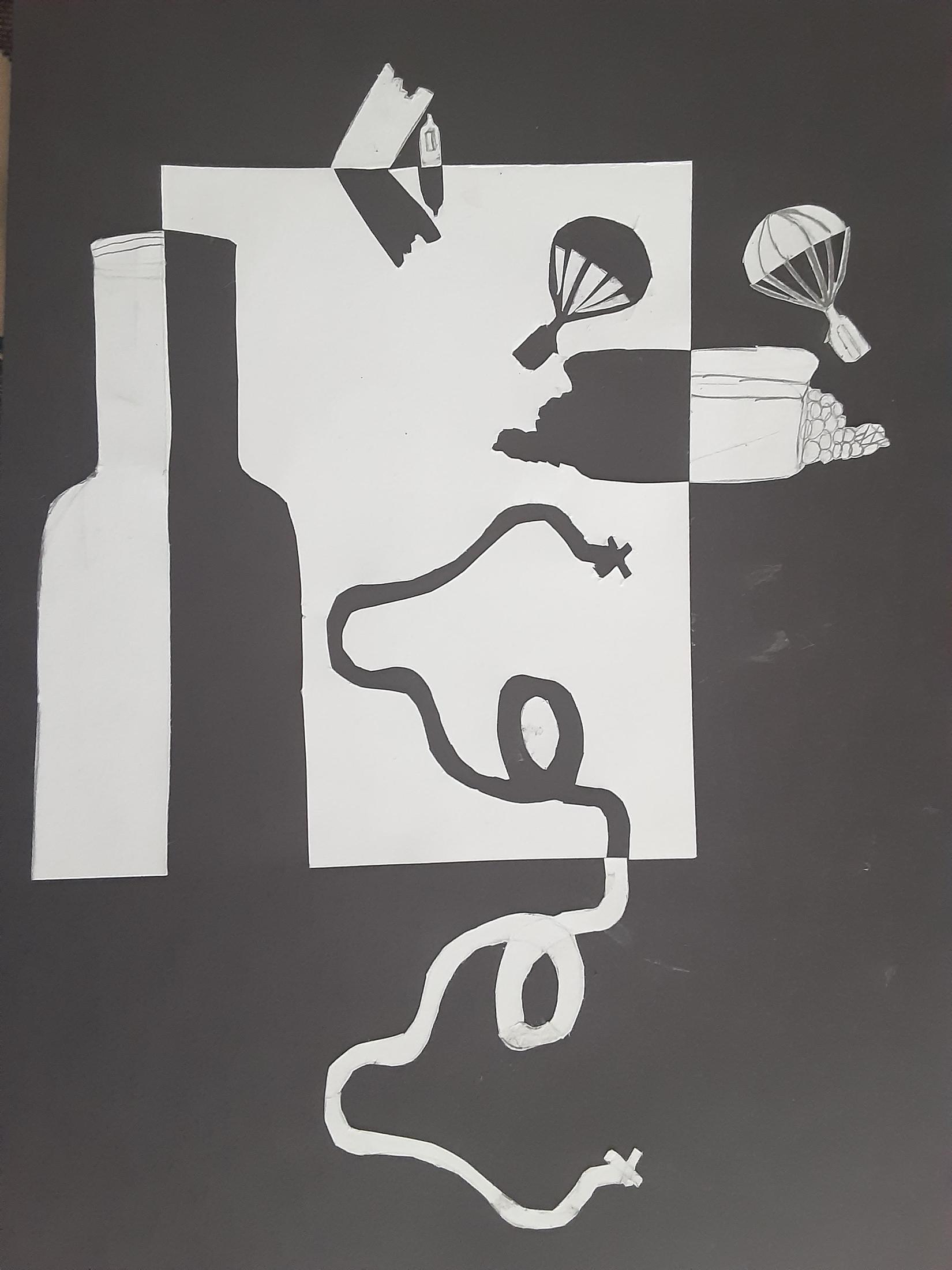
In this notan I used black and white paper. I made the theme map in a bottle because I wanted to make the notan seem like parallel adventures with the map. I wanted the parts that I cut out to seem like an adventure or journey that went wrong and the parts that were on the outside to represent the parts of the adventure split up and not together. In the parachute and journey to x marks the spot I had to cut out the white parts to make it visible but it was difficult because then the part on the outside seemed messy. To make the art on a different level I could make it more shipwrecked themed to portray my idea better. I could also make it seem like a map and show the obstacles on the way. Making that a notan could show the obstacles being knocked out which has a different idea/story it does correlate to the theme.
Enkhjin


(Artist Statement)
When you look at online pictures of nature, you always notice the green trees, the blue skies, and the crystal blue waters. But have you ever really looked at nature? If you look closely, there are so many reflections, and for that reason, this is why I chose nature as my theme. The reflection of the mountains on the water is the biggest in my art. But if you look even closer, you can see the reflection of the sky in the water. This is the difference between seeing and actually looking. You have to be able to look for tiny things. Even though I used the simple pencil and paper tools, it shows you can still demonstrate details. Using simple tools does come with challenges, though; it's hard to make things blend easily, and sometimes pencils can smudge. But you just have to work with it, and the result may be better than you think. But the main lesson here is that you should really look deeper into things.
I don’t normally do much free sketching. But one night, I just felt that I should sketch something. I went online and just searched for some easy sketches for beginners. Then I found one that I thought was reasonable, and I studied the image. I looked at the image for about 10 minutes, just looking at the little details. I went to my bed and began to draw. I just drew what I saw and even added some of my own touches.
I worked on the sketch for a while and realized that it was almost 1:00 am. in the morning, so I decided to go to bed. Then the next day, I felt so inspired I just kept going. I think this is what art is about. Art is not just doing it for a grade, but it's really about finding yourself and enjoying it. You have to be able to take risks and do things in your own time.
Before I decided to do this drawing, I never really did sketches, and I thought art wasn’t for me. But since I took this risk, I created this piece of art and actually be proud of it. I am not normally the kind of person to be proud of my work, but this time, I was. So, I think that if we all took risks, we could all be proud of ourselves and really enjoy ourselves.
Grace